
Indicator
Use the indicator widget to monitor and interpret the status of your industrial systems.
You can apply different colors and introduce gif animations to communicate a value or state effectively. The indicator widget helps to draw attention towards the changing status of a system and the indication to take corrective actions, if necessary. For a simpler version, use Simple Indicator.
The indicator widget is available under . When designing application pages, drag-and-drop Indicator to a container.
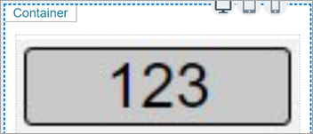
Bind the widget to a query and set the properties to appear at runtime. You can define unique properties for values within specific ranges, and also for values that are outside of any range.
Indicator Properties
| Field Name | Description |
|---|---|
| Multistate Indicator Value | The value is populated when you bind the indicator widget to a query. |
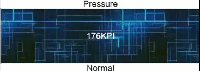
| Indicator Mode | Select to display output in any of these modes:
|
| Display Value? | Select the check box to display the analog value. |
| Repeat Background Image | Analog indicator mode: Select the check box to apply the background image repeatedly to provide a continuous background across the widget. |
| Width | Analog indicator mode: By default, the indicator widget occupies the width of its container. Reset the width in percentage or pixels. |
| Height | Analog indicator mode: By default, the indicator widget occupies the height of its container. Reset the height in percentage or pixels. |
| Size | Image and Status
indicator modes: For the image mode, enter the image size in pixels. For the status mode, enter the size to set the diameter of the indicator button. |
| Use Raw Format | Select the check box to display numbers in raw format. For example, a numeric value with 5 or more decimal places is shown as it is, and not rounded off. |
| Number of decimals | This option appears if you do not want to display numbers in raw
format. In that case, enter the decimal places (0-7) to consider after the decimal point to format large numbers. Based on the decimals, the value is rounded off to the nearest whole number. |
| Insert Commas | Select the check box to use comma as a thousands separator. A comma is inserted for every three digits. |
| Prefix Units | Enter the unit of measurement to appear as a prefix for the value. |
| Suffix Units | Enter the unit of measurement to appear as a suffix for the value. |
| Label Above | Enter the text to appear above the value. |
| Label Below | Enter the text to appear below the value. |
| Font Size | Enter the size of the font for the label text. |
| Font Family | Select a font family for the label text. |
| Font Color | Select a font color for the label text. |
| Background Color | Select a color to fill in the background for labels and values. |
| Background Image Mode | Use these options to set a background image for the
widget. Type: If you choose to set a
background image, then select from these two types:
Background Image Fit: Determines how the image fits into its container, whether to align horizontal (or) vertical. Background Image Position: Determines the position of the image, whether the image should be placed behind value only, (or) behind value and labels. Border Type: Select from
different types of border styles to apply to the background
image. Border Width (Pixels): Enter the width size if the widget has a border. Border Radius (Pixels): Enter the radius size to style the corners of a border. Border Color: Select a color for the border. |
| +Add Item | Select to customize settings for values within a specific range. Create an input range and highlight with unique colors and style. |
| Input Range Low (Greater than or Equal) | Enter the lowest value to create an input range. |
| Input Range High (Less than) | Enter the highest value to create an input range. |
| Hidden | Select this check box if you want to hide the
plug-in. To show the hidden plug-in in Operations Hub new layout, go
to Page Visuals and under
Action column, select  for the hidden plug-in. See Page Visuals Tab. for the hidden plug-in. See Page Visuals Tab. |
About Custom Range Settings
- Select
 for the custom range to move upwards in a list.
 - Select
 for the custom range to move downwards in a
list.
for the custom range to move downwards in a
list. - Select
 for the custom range to remove from the list. These inputs are deleted.