 Plant Applications
About OEE Dashboard
As a supervisor, you can use the OEE Dashboard application to review summary and status information for plant lines and units. Here, you can identify production inefficiencies contributing to lower OEE.
- OEE: Overall equipment effectiveness (OEE) is a measure of production health or status. By comparing OEE between machines or group of machines, you can identify lines or machines with production inefficiencies like waste, downtime, speed/performance loss, and production throughput that contribute to lower OEE.
- Performance: You can review line and unit performance rates to compare how much each line or unit produced against projections.
- Quality: You can review the quality rate to identify lines with high waste counts, which reduces quality and contributes to a lower OEE.
- Availability: You can review the Availability rate for a Machine or group of Machines for a selected time range (for example, Current Shift, Yesterday).
The following OEE Dashboard dashboard displays information for the selected department HISTCENT, viewed by Lines in that department. It contains KPI information for each of the lines collected over the past week.

When you expand a KPI card, you can review detailed information such as downtime reasons, downtime by category, scrap breakdown, and loss by category as Pareto and waterfall charts.
- In the Downtime Breakdown section, a Pareto chart displays the downtime breakdown by reasons, while in the Downtime by Category section, a waterfall chart displays the downtime by category.
- In the Downtime Breakdown or Downtime by Category section, select an option in the View by drop-down list box to view the chart by Duration or Count.
- You can access a similar expanded view for Quality and Performance KPIs.
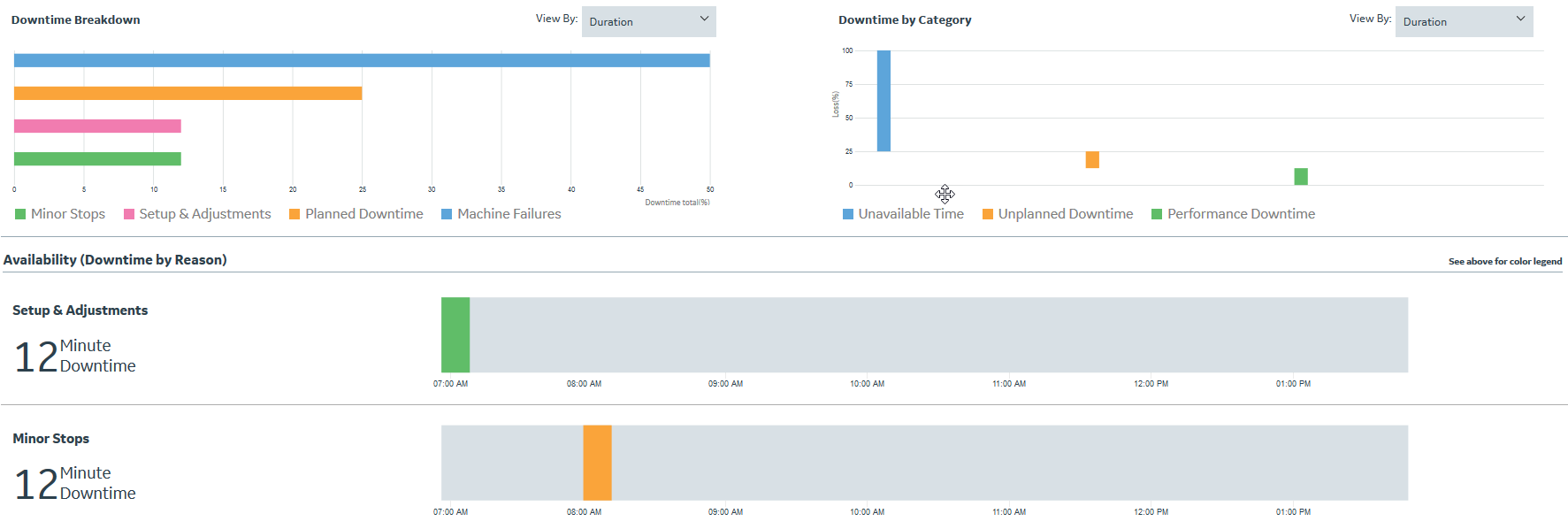
A Gantt chart displays the up and downtime on the time axis. The grey colored vertical strips represent the up-time, and the other colored strips display the downtime events for different categories.
If you select the Line level, the Gantt chart displays the downtime events for individual Units. If you select the Unit level, the Gantt chart displays the individual downtime reasons. In both the cases, colors displayed for the downtime events are based on the categories, and they are inconsistent with the Waterfall and Pareto charts.
- Fraction: Corresponding percentage of the total downtime
- Count: Number of events
- Duration: Downtime duration