
DataGrid
Use this widget to access advanced features of a table.
The datagrid widget is available under . When designing application pages, drag-and-drop DataGrid to a container.
The following list of properties are specific to this widget. For common properties, refer to Page Components (Classic).
Datagrid Properties
| Field Name | Description |
|---|---|
| BEHAVIOR > Selected Items Changed BEHAVIOR > Edited Rows Updated |
Use this property to define the action to be taken when a value is modified in the datagrid. For this behavior to work, you must also configure the Add Table Column for the modified value. |
| Source - Input | Use any of these options to provide values from a data source.
Note: Currently we do not support manually passing values to the
widget. |
| Use Raw Format | Select the check box to display numbers in raw format. For example, a numeric value with 5 or more decimal places is shown as it is, and not rounded off. |
| Number of decimals | This option appears if you do not want to display numbers in raw format.
In that case, enter the decimal places (0-7) to consider after the decimal point to format large numbers. Based on the decimals, the value is rounded off to the nearest whole number. The decimals will apply to all the datagrid columns that contain numeric values. |
| Height (px) - 0 equals dynamic | Set the height in pixels. If set to 0, the datagrid table occupies 100% of its container. |
| Border, Row and Column Lines Width (px) | Set the line width for the datagrid table border, rows, and columns. |
| Border Color | Select a color for the datagrid table border. |
| Show Borders | Select the check box to apply a border to the datagrid table. To remove the border, clear the check box. |
| Show Column Lines | Select the check box to display column gridlines. To remove gridlines, clear the check box. |
| Show Row Lines | Select the check box to display row gridlines. To remove gridlines, clear the check box. |
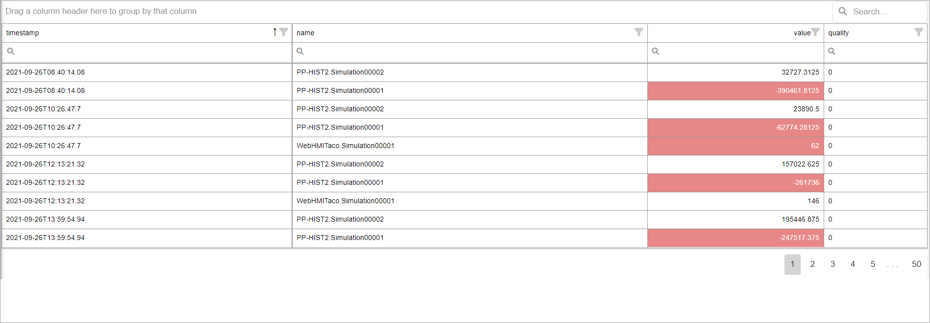
| Enable Search | Select the check box to add a search field above the datagrid widget to search the entire table. |
| Allow Grouping | Select the check box to allow grouping of columns at runtime.
To undo grouping, drag the columns back to their previous position. |
| Allow Filtering | Select the check box to allow filtering of data in every column. At
runtime, to filter values:
|
| Allow Edit | Select the check box if you want to modify grid data. An edit option
appears at runtime next to each row. 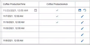 The modified data value must be sent to a target data source. To use the edit option successfully, configure the Add Table Column and Output Target properties. Changes are written to the target, and not to the input data source. Hence, you may lose edits on refreshing the page. |
| Allow Export | Select the check box to allow exporting data at runtime. |
| Allow Show/Hide Columns | If you select this check box, a column chooser icon appears on top of the
datagrid at runtime. A column chooser dialog appears, wherein you can drag-and-drop the datagrid columns you want to remove from the table. Similarly, you can also add the removed columns back to the table. |
| Allow Column Filtering | If you select this check box, a filter icon appears in every column to
filter out datagrid rows. At runtime, to filter values:
|
| Pages or scroll | If the number of rows exceed page size, then specify whether you want to
browse through pages, or scroll through data.
|
| Rows | Use these properties to configure datagrid table rows:
|
| Add Animation | Use this property to highlight a row when a condition is met. Boolean
values are represented with 1 or 0.This property is similar to Add Cell Animation. |
| Add Table Column | Use this property to customize the datagrid
columns. Select +Add Column to show
configuring options. Note: Add only the columns you want to customize. It is
not required to add all the columns. To organize table columns:
|
| Column | Use these properties to configure a column:
|
| Output Target | Select + Add Output Target to specify the target
data source for column data. At runtime, when column data is selected/modified,
the target specified in this property is triggered.
|
| Add Image | Use this property to deliver an image when a condition is met. Boolean
values are represented with 1 or 0.Select +Add Image to add a condition. You can add as many conditions as required.
|
| Add Cell Animation | Use this property to highlight a cell when a condition is met. Select
+Add Cell Animation to add as many conditions as
required. Boolean values are represented with 1 or
0.
|
| Group By | Set the default grouping of data by column.
|
| Sort By | Set the default sorting for data grid columns. For example, you can add
multiple items to configure default sorting first by column X, then by column
Y, etc in an ascending/descending order. The sequence of sorting order appears
at runtime indicated by a number.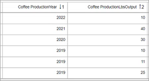 At runtime:
|
| Selected Rows Output | Specify the target data source for a selected row data. A separated
string or array can be written to a global variable.
|
| Hidden | Select this check box if you want to hide the
plug-in. To show the hidden plug-in in Operations Hub new layout, go
to Page Visuals and under
Action column, select  for the hidden plug-in. See Page Visuals Tab. for the hidden plug-in. See Page Visuals Tab. |
 and
and  to rearrange order of columns in the
datagrid.
to rearrange order of columns in the
datagrid. next to it.
DataGrid at Runtime
You have the option to export and download the datagrid table data. Select  icon that
appears at runtime at the top of the table to export the data to an Excel file.
icon that
appears at runtime at the top of the table to export the data to an Excel file.