Check Box
A check box widget is used to allow application users to choose between two mutually exclusive options. For example, you can use a check box to allow the application user to specify whether the user has read the license agreement. You can also use a check box to display or hide other widgets on the page.
Check Box Settings
When you use a check box widget, in addition to providing values for the default fields for a widget, you must define the following settings:
| Type of the Setting | Description |
|---|---|
| Target Data | If this check box only represents input to a single query, you can select the target input from the list of inputs to the queries that have been added in the Page Data section. |
| Source | Identifies the source of the check box value. You can specify one of the following types of sources:
|
Using a Check Box to Display or Hide a Camera Button
To use a check box widget to display or hide a Camera button, perform the following steps:
- Add the check box and camera widgets to the page.
- In the CHECKBOX PROPERTIES section, enter values in the Label and Id boxes, and then select the Global Data check box.
- In the CAMERA PROPERTIES section, select Add conditions.
- In the Camera Conditions window, select Add condition, and then enter or select values as shown in the following image.
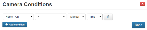 Note: In this case, CB was the ID specified for the check box widget.
 - Select Done, and then save the application.
In the application, the Camera button appears only if you select the check box.