Dashboard Widgets
About Widgets
Use widgets to access data for an asset context.
Widgets allow you to visualize data available in Predix Essentials.
Predix Essentials utilizes both configurable and non-configurable widgets, either of which can be added to a card. You can add multiple rows of tiles to a card, adding the widgets you want in a customizable layout.
Widgets are added in the widget library. Each added widget can be configured based on your needs.
Predix Essentials has instituted versioning for widgets. Older widget versions that are in use are supported; however, they are not available for inclusion in your cards. If you are using an older widget version, you should migrate to the newer version.
All widgets have a responsive aspect ratio.
Summary widgets used for the Dashboard Summary card will only appear as selections when they are added. They are not included in the main widget library.
Once a configurable widget is added to a card, you can modify or delete it. Non-configurable widgets can be added or deleted. Navigation is preset for non-configurable widgets, and can be set for many of the configurable widgets.
| Widget | Description | Configurations Options |
|---|---|---|
| Generic Graph Widget | The Generic Graph widget is used to visualize time series data related to asset tags in the widget. This widget can be used in all the supported dashboards layouts. | Title: Name of the widget as configured in the dashboard. The default name is Generic Graph Widget. This can be entered in any local language for internationalization and is not automatically translated. Limited to 50 characters. Chart Type: This widget can be configured to plot the time series data either as a line chart or scatter chart. Timespan: The default time duration for this widget can be configured to any of the following values:
Refresh Rate: This option allows you to configure the widget to auto refresh at a specific rate. The options are:
Data Operation: This option allows you to configure to view the data as interpolated or raw data. Navigator: This option allows you to enable the chart navigator to display with the widget. This option is to be used only when the widget displays in the full-width layout. Asset Name in Tooltip: This option enables you to view the name of the asset along with the tag name when you hover over the charts in the widget. This option is useful when you have tags from multiple assets configured in the widget. This shows which tag belongs to which asset when you view the values on the chart in the widget. Threshold: This option allows you to configure a threshold line in the chart. The threshold value is a static value that is drawn on the chart in the widget. Data: This option allows you to configure the tags associated with the chart in the widget. You can select up to 10 tags from one or more assets. This section allows you to add more assets in the context for the dashboard. This allows the dashboard to visualize data from multiple assets. Navigation: This option allows you to set the application that you navigate to from the widget. You can add multiple navigation links from the widget. The options are:
When you navigate from the widget to the other application, the context is passed to the other application and is set in the destination application.
|
| Interactive Generic Graph Widget | The Interactive Generic Graph widget is used to visualize time series data related to asset tags in the widget. This widget can be used in all supported dashboard layouts. | This widget supports all the configuration options available in the Generic Graph Widget. The additional options that are available are: Sends Data: If this option is enabled, the widget sends time information to all the widgets in the card when a point in the chart is selected. If the other widgets are listening to that event, the point on the other chart that corresponds to the set time is highlighted. Receives Data: If this option is enabled, the widget receives time information from other widgets and responds to that message by highlighting points on the chart that correspond to the time stamp in the message that was received. |
| Scatter Chart | The Scatter Chart widget is used to visualize the correlation between different tags on one or more assets based on the time series data of the tags. The Scatter Chart widget selects tags from asset or chooses tags plus children tags from any asset in the hierarchy for the data. The Scatter Chart widget uses interpolated data to show the correlation of two tags. | Title: Name of the widget as configured on the dashboard. The default name is Scatter Chart. This can be entered in any local language for internationalization and is not automatically translated. Limited to 50 characters. Timespan: The default time duration for this widget can be configured to any of the following values:
Refresh Rate: This option allows you to configure the widget to auto refresh at a specific rate. The options are:
Data: This option allows you to configure the tags used on the x- and y-axis of the chart. You can select the tags on the x- and y-axis based on the base asset context, creation of the dashboard, or tags from any child assets. You can search by typing in the search field. Navigation: This option allows you to set the application that you navigate to from the widget. You can add multiple navigation links from the widget to allow you to choose where to go from the widget. The options are:
Goes to: This option allows you to select the navigation path. Sends Data: If this option is enabled, the widget sends time information to all the widgets in the card when a point in the chart is selected. If the other widgets are listening to that event, the point on the other chart that corresponds to the set time is highlighted. Receives Data: If this option is enabled, the widget receives time information from other widgets and responds to that message by highlighting points on the chart that correspond to the time stamp in the message that was received. Tag search box: Enter at least three characters into the Search field to find a data item. |
| Open Cases | The Open Cases Widget is used to view all the open cases that exist at the hierarchy level when the dashboard loads. | No configuration options exist for this widget. |
| Ambient Conditions | The Ambient Conditions widget is a limited utility widget that has been developed primarily for demonstrating the dashboarding capability. Use this widget only in 1/3 of the dashboard layout. | Title: Name of the widget as configured on the dashboard. The default name is Ambient Conditions. This can be entered in any local language for internationalization and is not automatically translated. Limited to 50 characters. Refresh Rate: This option allows you to configure the widget to auto refresh at a specific rate. The options are:
Plotted Tags: This option allows you to select the two tags that can be associated with the widget. The first tag associates with the Temperature that displays in the widget. The widget displays the most recent value of this tag in the widget. The second tag associates with the Relative Humidity that displays in the widget. The widget displays the most recent value of this tag in the widget. |
| Unclaimed Alerts | The Unclaimed Alerts widget is used to view all the unclaimed alerts that exist at the hierarchy level on loaded dashboards. | This widget is not configurable but displays the number of unclaimed alerts of Severity 1, Severity 2, and Severity 3 in the widget. |
| Monitoring & Diagnostics | The Monitoring and Diagnostics Outcomes widget is used to view the outcomes of all the cases that have been closed for the assets at the hierarchy level on loaded dashboards. | This widget is not configurable but displays the number of cases that are closed with different closure codes for all the cases that are closed for that assets. |
| Small List | The Small List Widget is used to display the most recent alerts or cases for the asset that the dashboard is in the context of. You can use this in 1/3 of the dashboard layout.If you select an alert or a case on the widget, then they are automatically moved to the selected alert or case. | Title: Name of the widget as configured on the dashboard. The default name is Small List. This can be entered in any local language for internationalization and is not automatically translated. Limited to 50 characters. Timespan:
Refresh Rate: This option allows you to configure the widget to auto refresh at a specific rate. The options are:
Data : This option allows you to choose Alerts or Cases. It also allows you to select what displays in each column in the table. Navigation: This option allows you to set the application that you navigated to from the widget. You can add multiple navigation links from the widget. The options are:
|
| Spider Web Chart | The Spider Web Chart widget is used to configure a spider web chart in the widget using three or more asset tags from one or more assets. This provides information for the correlation between the tags over the time duration selected on the dashboard or on the widget. This widget also computes the average values for these tags over the time period. A visual indicator provides information on whether or not the actual tag values are exceeding the average values. The Spider Web Chart widget plots the latest time series value of all tags based on the Predix Essentials time series query. You can select tags from asset or choose tag plus child tags from any asset in the hierarchy for the data. And this widget displays the latest value for each tag. The default value is 15 days. | Title: Name of the widget as configured on the dashboard. The default name is Spider Web Chart. This can be entered in any local language for internationalization and is not automatically translated. Limited to 50 characters. Layout: The Spider Web Chart is pre-selected and cannot be modified. Show Average Values: This option allows you to choose if they want to see the average values plotted on the chart along with the actual values. The default setting for this option is off. Turning on this option makes the Timespan drop-down list box appear. Timespan: The timespan for this widget can be configured to any of the following values:
Refresh Rate: This option allows you to configure the widget to auto refresh at a specific rate. The options are:
Tag search box: Enter at least three characters into the Search field to find a data item. Data: This option allows you to configure the tags that are associated with the chart on the widget. You can select up to nine tags from one or more assets. This section allows you to add tags from either the base asset or any other child assets. A minimum number of three tags are needed for this widget. Navigation: This option allows you to set the application that you navigate to from the widget. You can add multiple navigation links from the widget. The options are:
|
| Vertical Grouped Bar Chart | The Vertical Grouped Chart is used to visualize the Alerts or Cases open for the asset in context. In addition, it is used to group them based on the various attributes of the alerts or cases. | Title: Name of the widget as configured on the dashboard. The default name is Vertical Grouped Chart. This can be entered in any local language for internationalization and is not automatically translated. Limited to 50 characters. Layout: This option allows you to select the layout of the grouped bar chart. The options are
Timespan: This allows you change the default time duration for this widget. The options are:
Refresh Rate: This option allows you to configure the widget to auto refresh at a specific rate. The options are:
Data : This option allows you to select the data that is visualized in the widget. You can select Primary Data or Secondary Data. Primary Data: This option allows you to make a few selections. First, select Alerts or Cases. If you choose Alerts, you can select the following additional display and grouping options:
Secondary Data: This option allows you to select the same set of options listed above but use them as grouping options for the Alerts or Cases Data. Navigation: This option allows you to set the application that you would be navigating to from the widget. You can add multiple navigation links from the widget. The options are:
View by: This option displays a list with secondary filters that you can apply to widgets. |
| KPI Widget | The KPI Widget is used to view a KPI and the trend of the KPI over a specified time interval. This widget is to be deployed in 1/3 of the dashboard layout. The KPI Widget displays the latest time series value, trend indicator, and raw data (line). You can also select tags from asset or choose tag plus child tags from any asset in the hierarchy for the data at only instance level not context-level. | Title: Name of the widget as configured on the dashboard. The default name is "KPI Overview". This can be entered in any local language for internationalization and is not automatically translated. Limited to 50 characters. Timespan: The default time duration for this widget can be configured to any of the following values:
Refresh Rate: This option allows you to configure the widget to auto refresh at a specific rate. The options are:
Data: This option allows you to configure the tag associated with the chart on the widget. You can only select one tag for this widget. Once selected, you can configure the optional indicators and KPIs that display. Navigation: This option allows you to set the application that you would be navigating to from the widget. You can add multiple navigation links from the widget. The options are:
Trend Indicator: This option allows you to view how the KPI is trending. Red dot: This dot indicates that the data point is not the latest. |
| Data Grid Widget | Does not apply to Predix Essentials:The Data Grid Widget is used to visualize the output of a predefined query that has been stored in the system. | Title: Name of the widget as configured on the dashboard. The default name is the name of the query that is configured in the widget. This can be entered in any local language for internationalization and is not automatically translated. Limited to 50 characters. Path: This option allows you to choose the query to visualize on the widget. |
| Enhanced Graph Widget | Does not apply to Predix Essentials:The Enhanced Graph Widget is used to visualize a predefined graph that has been stored in the system. | This widget is configured to use an existing graph object that has already been created. Title: Name of the widget as configured on the dashboard. The default name is the name of the graph that is configured in the widget. This can be entered in any local language for internationalization and is not automatically translated. Limited to 50 characters. Path:This option allows you to choose the graph that you want to visualize on the widget. Refresh Rate: This option allows you to configure the widget to auto refresh at a specific rate. The options are:
Sends Data: This option allows you to initiate inter widget communication interactions from the widget. Receives Data: This option allows you to participate in inter widget communication interactions from other widgets in the card on the dashboard. |
| Enhanced KPI Widget | Does not apply to Predix Essentials:The Enhanced KPI Widget is used to visualize a preexisting KPI that has been stored in the system. | Title: Name of the widget as configured on the dashboard. The default name is the name of the KPI that is configured in the widget. This can be entered in any local language for internationalization and is not automatically translated. Limited to 50 characters. Select a KPI from the list of all the KPIs that exist in the system. |
| Hyperlink Widget | Does not apply to Predix Essentials:The Hyperlink widget is used to embed one or more hyperlinks in either internal or external pages/sites. | Title: Name of the widget as configured on the dashboard. The default name is "Hyperlink Widget". This can be entered in any local language for internationalization and is not automatically translated. Limited to 50 characters. Add Hyperlink: This option allows you to add a new hyperlink to the widget. Each Hyperlink contains the name of the hyperlink and the URL for the hyperlink. |
| Image View Widget | Does not apply to Predix Essentials:The Image View Widget is used to visualize an image from a publicly accessible site on the widget. | Title: Name of the widget as configured on the dashboard. The default name is empty. This can be entered in any local language for internationalization and is not automatically translated. Limited to 50 characters. URL: This option allows you to embed the URL of the image that you want to visualize on the widget. This has to be a publicly addressable URL that can be accessed from the cloud platform without any user credentials. |
| Widget | Description | Configuration Options |
|---|---|---|
| KPI Summary | The KPI Summary widget is used to add in summary widgets to the dashboard. The KPI Summary widget displays the latest time series value, trend indicator, and raw data (line) You can also select tags from asset or choose tag plus child tags from any asset in the hierarchy for the data at only instance level not context-level. | The Configure Dashboard Summary option, allows you to customize your dashboard. Title: Name of the widget as configured on the dashboard. The default name is KPI Summary. This can be entered in any local language for internationalization and is not automatically translated. Limited to 50 characters. Refresh Rate: This option allows you to configure the widget to auto refresh at a specific rate. The options are:
Data: This option allows you to configure the tags used on the x- and y-axis of the chart. You can select the tags on the x- and y-axis based on the base asset context, creation of the dashboard, or tags from any child assets. Trend Indicator: This option allows you to view how the KPI is trending. Red dot: This dot indicates that the data point is not the latest. Tag search box: Enter at least three characters into the Search field to find a data item. |
Add and Delete Widgets on a Card
You can add configurable widgets in the widget library to the provided card layouts in the card library, or to your own custom card.
About This Task
Each widget in the widget library displays a thumbnail image and description allowing you to make informed choices.
- From the widget library during the creation of a new card.
- From the widget library to an existing card.
Deleting all widgets in a row deletes the row in the card.
Procedure
Add or Delete Widgets on a Dashboard Summary Card
Before You Begin
About This Task
The Dashboard Summary card contains a minimum of three tiles by default. You can add or delete up to three more tiles for a total of six. You can add or delete widgets for the available tiles. When adding widgets, only the summary widgets are available.
Procedure
- To add a tile to a dashboard summary card:
- Select Configure Dashboard Summary for a new dashboard summary card.Alternatively, you can select
 , and then select Configure Dashboard Summary.
 - Select
 next to the tiles to add a new tile.A new tile appears to the right.Tip: The Dashboard Summary card can encompass up to six tiles, and must contain at least three tiles.
- Select Configure Dashboard Summary for a new dashboard summary card.
- To delete a tile in a dashboard summary card:
- Select , and then select Configure Dashboard Summary.
- Select
- To add a widget to a dashboard summary card:
- Access the Dashboard Browser.
- Use the Context Browser to select an asset context.
- Select the view containing the dashboard summary card.
- Select , and then select Configure Dashboard Summary.
- Select Add Widget to access an empty widget tile in your card layout.
- In the widget library, select Add for your preferred widget.
- Select Save when you have finished adding all the widgets to save your changes.
- To delete a widget in a dashboard summary card:
- Select , and then select Configure Dashboard Summary.
- Select
Add, Edit, or Delete a Tag Expression from a Dashboard
About This Task
You can add, edit, or delete a tag expression from a widget using the Dashboard module.
Procedure
- To create a new Tag Expression on a new Dashboard:
- To create a new Tag Expression on an existing Dashboard:
- Select , and then select Edit Dashboard.
- Select
- To modify an existing Tag Expression in a Dashboard:
- Access the Dashboard Browser.
- Select a dashboard.
- Select , and then select Edit Dashboard.
- Select the Expressions tab.
- Hover over a Tag Expression, and then select Edit.
- Modify the settings as needed.
- Select Done.
- To delete an existing Tag Expression in a Dashboard:
- Select , and then select Edit Dashboard.
- Select
- To add a Tag Expression to a Tag Expression enabled widget:
- To remove a Tag Expression from a Tag Expression enabled widget:
Configure Widgets
Widgets control the data displayed on cards.
The card library includes widgets in the Overview card, and a Custom card where you can add widgets to fit your needs.
- Generic time series chart widget.
- Interactive generic time series chart widget.
- Scatter Chart widget.
- Ambient Conditions widget.
- Small List widget.
- Spiderweb chart widget.
- Vertical Grouped bar chart widget.
- Goals KPI widget.
- KPI widget.
- Summary KPI widget.
- Summary Count widget.
- Does not apply to Predix Essentials: Calendar widget
- Unclaimed Alerts and Events: Unclaimed count for severity 1, 2, and 3 alerts.
- Open Cases: Count of current open cases, displayed as a stacked chart and grouped by severity.
- Monitoring & Diagnostics Outcomes: Historical outcomes for cases grouped by resolution code, displayed as a stacked chart.
- Does not apply to Predix Essentials: Asset Criticality: Displays the criticality number assigned to an asset context.
- Does not apply to Predix Essentials: Completed Work Orders: Displays the ten most recent completed work orders for an asset context.
- Does not apply to Predix Essentials: Open Work Orders: Displays the 10 most recent open work orders for an asset context.
- Does not apply to Predix Essentials: Recommendations: Displays all Recommendation records for an asset context.
Configuration for Generic Graph Widget
The Generic Graph widget allows you to create a line chart using time series data from the assets that exist in Predix Essentials. The widgets allow you to configure. This configuration adds navigation and an auto-refresh interval to the widget.
- Modify the Title to Heat Rate Performance.
- Select Line Chart in the Chart selections.
- Select Every 3 minutes in the Refresh box.
- Select a tag to display the time series output.
- Select On in the Navigation box.
- Select Done to exit modify mode.
- Select Save to save the widget changes.
Configuration for Ambient Conditions Widget
Ambient Conditions - Site relative humidity, displayed as a percentage, and site temperature, displayed in degrees Celsius.
- Modify the Title to Ambient Conditions.
- Select the first tag, which displays the temperature.
- Enter Temperature in the Name box.
- Select the second tag, which displays the relative humidity.
- Enter Humidity in the Name box.
- Select Done to exit modify mode.
- Select Save to save the widget changes.
Configuration for Interactive Generic Graph Widget
The Interactive Generic Graph widget allows you to create a line chart using time series data from the assets that exists in Predix Essentials. The additional functionality allows the widget to communicate with the other interactive graph widgets in the card to synchronize the time context between the widgets. This configuration adds navigation and an auto-refresh interval to the widget along with whether this widget can receive messages from other widgets, or if it can send messages to other widgets. It can also be configured to do both.
- In the Widget Communication, toggle Send and Receive to On.
- Select a tag to display the time series output.
- Select Done to exit modify mode.
- Repeat for each additional widget.Tip: Change the Title for each widget to match the tags for temperature and pressure.
- Select
 for one of the widgets.Note: All widgets must be on the same card.
 - Select Save to save the widget changes.
Configure Time Series Interactive Chart Widgets
Use the time series interactive chart widget to track possible issues at a glance.
About This Task
You can access cross-tenant asset resources that have been assigned to you. When selecting a destination for your widget, these resources are available for selection. If the resource you need is unavailable, contact your administrator.
Procedure
- Hover over a time series interactive chart widget, and then select
 .
. - Each interactive time series widget can be uniquely configured. Use the following options to configure the widget:
For this option Do this Title field Enter a name for the widget Chart icons Select a chart type icon. Timespan box Select a time span option in the list. Refresh box Select a refresh option. Threshold field Enter a static value. Sends Data toggle Select on or off. Receives Data toggle Select on or off. Navigation Add icon Select to begin destination selections.Select Destination box In Select Destination list, select a module or Dashboard. Set Context link When Dashboards is selected, use the Context Browser to select an asset, then use the View box to select a view. Enable toggle Select on or off. You can select multiple destinations for the widget. Use to enable or disable destination targets for the widget.
Configure Time Series Generic Chart Widgets
Use the time series generic chart widget to monitor an asset or issue.
About This Task
You can configure this widget to navigate to the Analysis chart, select raw or interpolated data for display, and control refresh rates. Selecting the Navigator option allows you to manipulate the amount of data available in the widget using the Timeline Slider. If you set your preferred time zone in the user management, the widget displays data for your preferred time zone.
You can access cross-tenant asset resources that have been assigned to you. When selecting a destination for your widget, these resources are available for selection. If the resource you need is unavailable, contact your administrator.
Procedure
- Hover over a time series generic chart widget, and then select .
- Each generic time series widget can be uniquely configured. Use the following options to configure the widget:
For this option Do this Title field Enter a name for the widget. Chart icons Select a chart type icon. Timespan drop-down list box Select a time span option in the drop-down list box. Refresh drop-down list box Select a refresh option. Data Operation drop-down list box Select between Interpolation and Raw to select the type of data displayed. Navigator toggle Select on or off to add a time line slider below the chart. Threshold field Enter a static value. Navigation Add icon Select to begin destination selections.Select Destination drop-down In the Select Destination drop-down list box, select a module or Dashboard.
Configure Ambient Conditions
Use the ambient conditions widget to display data for two tags.
About This Task
You can configure the ambient conditions widget to track two tags in their unit of measure for an asset context. For example, you can track weather information for the asset context.
You can access cross-tenant asset resources that have been assigned to you. When selecting a destination for your widget, these resources are available for selection. If the resource you need is unavailable, contact your administrator.
Procedure
- Hover over an ambient conditions widget, and then select .
Configure Vertical Grouped Bar Chart Widgets
Use grouped bar charts to compare data for analysis, alerts, cases, or dashboards.
About This Task
You can configure this widget to navigate to the analysis, alerts or cases module, or a dashboard for a selected asset context, then select a time span to monitor.
Configuration for the Grouped Chart can differ from older versions. If you are using the Grouped Chart widget, you should migrate to the current version.
You can access cross-tenant asset resources that have been assigned to you. When selecting a destination for your widget, these resources are available for selection. If the resource you need is unavailable, contact your administrator.
Procedure
- Hover over a grouped bar chart widget, and then select .
- Each grouped bar chart widget can be uniquely configured. Use the following options to configure the widget:
For this option Do this Title field Enter a name for the widget. Layout drop-down list box Select a layout option. Timespan drop-down list box Select a timespan option for the data applied to the widget. Refresh Rate drop-down list box Select a refresh option. Navigation toggle Select on or off. Goes To drop-down list box Select Dashboards for the navigation destination. For When Dashboards is selected, select Set Context and use the Context Browser to select an asset, then use the View drop-down list box to select a view. You can select multiple destinations for the widget. Use
to enable or disable destination targets for the widget. - Select
 for the Primary Data Item in the Data section.
 - In Grouped By, select for the Secondary Data Item.
- In the Navigation, select , and then select the destination in the box.
Configure Spider Web Chart Widgets
Use a Spider Web Chart widget to compare values across three to nine plotted tags.
About This Task
This chart can display the average values for the tags based on the selected timespan. You can configure this widget to navigate to an Analysis chart, Alerts, Cases, or Dashboard for a selected asset context, and control refresh rates.
Configuration for the Spider Web Chart can differ from older versions. If you are using the Spider Web Chart widget, you should migrate to the current version.
You can access cross-tenant asset resources that have been assigned to you. When selecting a destination for your widget, these resources are available for selection. If the resource you need is unavailable, contact your administrator.
Procedure
- Hover over a Spider Web Chart widget, and then select .
Configure Goals KPI Widgets
Use the Goals KPI widget to compare actual computed values with set goal values for an asset context.
About This Task
You can display a fill pattern for the Goal KPIs to visualize if the actual asset performance is within the set parameters. You can change tag names, and set a filter for each plotted tag. Tags are displayed in the order they are selected for the chart.
You can access cross-tenant asset resources that have been assigned to you. When selecting a destination for your widget, these resources are available for selection. If the resource you need is unavailable, contact your administrator.
Procedure
- Hover over a goals KPI widget, and then select .
- Each goals KPI widget can be uniquely configured. Use the following options to configure the widget:
For this option Do this Title field Enter a name for the widget. Layout field The Goals KPI widget is pre-selected and cannot be modified. Refresh Rate drop-down list box Select an option. Fill Goal Area toggle Select on or off to add a fill for the set goals KPIs in the spiderweb chart. Add Navigation icon Select to add navigation for the widget.Navigation destination On Goes To, select Analysis View, Asset, or Dashboards. Navigation context When Dashboards is selected, use the Context Browser to select an asset, and then use the View drop-down list box to select a view. Enable icon Select on or off to enable or disable navigation for a specific destination. - Select next to an Actual tag or Goal tag place holder.
- Select
 , and then enter at least three characters that match a tag or child tag name into the Search field to find suitable tags for plotting.Important: When you add an Actual tag, you must add a Goal tag so they can display in pairs.
 - In the Search Results, select next to a tag selection, and then select Add.The tag selection is added to the Plotted Tags list at the bottom of the list for that category.Note: Add at least three and up to nine tags for Actual and Goal Tags categories, for a total of eighteen tags.
Configure KPI Widgets
Use the KPI widget to monitor one or more KPIs.
About This Task
The KPI widget can be configured to display selected KPIs for the selected asset. Once a data item has been selected, the unit of measure appears automatically.
You can access cross-tenant asset resources that have been assigned to you. When selecting a destination for your widget, these resources are available for selection. If the resource you need is unavailable, contact your administrator.
| Selecting this | Means this |
|---|---|
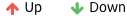
 | A green up-arrow signifies that the value for the KPI is greater than that recorded in the previous data retrieval. A red down-arrow signifies that the value for the KPI is lower than that recorded in the previous data retrieval. In this case, the up-arrow is the desired trend. |
 | A red up-arrow signifies that the value for the KPI is greater than that recorded in the previous data retrieval. A green down-arrow signifies that the value for the KPI is lower than that recorded in the previous data retrieval. In this case, the down-arrow is the desired trend. |
 | A grey up-arrow signifies that the value for the KPI is greater than that recorded in the previous data retrieval. A grey down-arrow signifies that the value for the KPI is lower than that recorded in the previous data retrieval. In this case, the direction of the arrow is informational. |
Procedure
- Hover over a KPI widget, and then select .
- Each KPI widget can be uniquely configured. Use the following options to configure the widget:
For this option Do this Title field Enter a name for the widget. Layout field The KPI grid is pre-selected and cannot be modified. Timespan drop-down list box Select a timespan option for the data applied to the widget. Refresh Rate drop-down list box Select a refresh option. Navigation toggle Select on or off. Goes To drop-down list box Select Analysis View or Dashboards. For When Dashboards is selected, select Set Context and use the Context Browser to select an asset, and then use the View drop-down list box to select a view. Trend toggle Select the data item, then select on or off for the trend indicator you want to use. Note: You can select only one indicator.You can select multiple destinations for the widget. Use
to enable or disable destination targets for the widget. - In Data, use to find at least one KPI tag to plot, and then select next to your selection.Selecting a data item a second time allows you to select and enable a Trend Indicator.
Configure Small List Widgets
Use the Small List widget to monitor four of the most recent alerts or cases.
About This Task
You can access cross-tenant asset resources that have been assigned to you. When selecting a destination for your widget, these resources are available for selection. If the resource you need is unavailable, contact your administrator.
About This Task
| Severity Level | Definition |
|---|---|
| 1 | Is a red box with the number one in it. |
| 2 | Is a red box with the number two in it. |
| 3 | Is a red box with the number three in it. |
| 4 | Is an orange box with the number four in it. |
| 5 | Is an orange box with the number five in it. |
Procedure
- Hover of a Small List widget, and then select .
- Each Small List widget can be uniquely configured. Use the following options to configure the widget:
For this option Do this Title field Enter a name for the widget. Timespan field The most recent four entries is default. Refresh Rate drop-down list box Select a refresh option. Navigation toggle Select on or off. Goes To drop-down list box Select a module or Dashboard in the list. For When Dashboards is selected, use the Context Browser to select an asset, and then use the View drop-down list box to select a view. You can select multiple destinations for the widget. Use
to enable or disable destination targets for the widget. - Select for the Primary Data Item in the Data section.
Configure Scatter Chart Widgets
Use the Scatter Chart widget to display correlations between two parameters or tags.
About This Task
Use the Scatter Chart widget for the extent of correlation to appear, if any, between the values for two parameters or tags. This widget uses interpolated data to display the correlation of the two tags.
You can access cross-tenant asset resources that have been assigned to you. When selecting a destination for your widget, these resources are available for selection. If the resource you need is unavailable, contact your administrator.
Procedure
- Hover over a Scatter Chart widget, then select .
- Each Scatter Chart widget can be uniquely configured. Use the following options to configure the widget:
For this option Do this Title field Enter a name for the widget. Layout text field View the layout. Timespan drop-down list box Select a timespan option. Refresh drop-down list box Select a refresh option. Navigation toggle Select on or off. Goes To drop-down list box Select a module or Dashboard. For When Dashboards is selected, use the Context Browser to select an asset, and then use the View drop-down list box to select a view. Sends Data toggle Select on or off. Receives Data toggle Select on or off. Zoom Drag your cursor over the area to zoom. You can perform multiple zoom actions. The zoom selection includes any stacked charts. Tooltip Hover over a chart data point to view data in a tooltip. Pan Select to pan in or out of the chart. You can select multiple destinations for the widget. Use to enable or disable destination targets for the widget. - Select next to the X-Axis option in the Data section to select a tag for plotting.
- Select next to a tag to plot it to the chart, and then select Add.
- Select next to the Y-Axis option in the Data section, then search for and add a tag.
Configure Summary KPI Widget
Use the Summary KPI widget to display overall key performance indicators for the selected asset.
About This Task
The Summary KPI widget can be configured to display selected KPIs for the selected asset. Once a data item has been selected, the unit of measure appears automatically. The KPI displays the latest value for a 30-day time span.
You can access cross-tenant asset resources that have been assigned to you. When selecting a destination for your widget, these resources are available for selection. If the resource you need is unavailable, contact your administrator.
| Selecting this | Means this |
|---|---|
| A green up-arrow signifies that the value for the KPI is greater than that recorded in the previous data retrieval. A red down-arrow signifies that the value for the KPI is lower than that recorded in the previous data retrieval. In this case, the up-arrow is the desired trend. |
| A red up-arrow signifies that the value for the KPI is greater than that recorded in the previous data retrieval. A green down-arrow signifies that the value for the KPI is lower than that recorded in the previous data retrieval. In this case, the down-arrow is the desired trend. |
| A grey up-arrow signifies that the value for the KPI is greater than that recorded in the previous data retrieval. A grey down-arrow signifies that the value for the KPI is lower than that recorded in the previous data retrieval. In this case the direction of the arrow is informational. |

| A red dot signifies that the data point is not the latest version. |
Procedure
- In , select Edit Dashboard, select the Dashboard Summary toggle to On, and then select Save and Done.
- In , select Configure Dashboard Summary.
- Hover over the Summary KPI widget, and then select .
- Select next to the Data Item.
What To Do Next
Configure Summary Count Widget
Use the Summary Count widget to display a data item count value and total for the selected asset context.
About This Task
The Summary Count widget can be configured to display the count value and total of a selected module's data item for a selected asset context. These values are not stored as tags. Once a data item has been selected, the unit of measure displays automatically. The KPI displays the latest value for a six-month time span.
You can access cross-tenant asset resources that have been assigned to you. When selecting a destination for your widget, these resources are available for selection. If the resource you need is unavailable, contact your administrator.
Procedure
- In , select Edit Dashboard, and then select Dashboard Summary toggle to On, then select Save.
- In , select Configure Dashboard Summary.
- Hover over the summary single sum widget, and then select .
- Select next to the Data Item to select a parent asset context.
- Select next to Grouped By to select a data item.You can select a data item in the Asset Attributes, Alerts, or Cases categories.
What To Do Next
Configure Calendar Widget
About This Task
This features does not apply to Predix Essentials. You can customize the widget by configuring its options.
You can access cross-tenant asset resources that have been assigned to you. When selecting a destination for your widget, these resources are available for selection. If the resource you need is unavailable, contact your administrator.
Procedure
- To add a widget, select Calendar Widget, and then select .
Modify Widgets
Each widget type contains its own configuration options.
Specific widgets have configuration options that are complex and need extra explanation to set up properly. Some options are configured differently depending on the widget selected and the purpose of the widget.
For instance, configuring navigation from a widget to an analysis chart is relatively simple to set up. Whereas configuring navigation to an alert or case Inbox may require data selection, and configuring navigation to a dashboard requires context and view selection.
Configuring communication for widgets may require you to select send only, receive only, or both, again depending upon the purpose of the widget.
Widget refresh is relatively simple to configure, however setting up widget refresh using time control requires more thought.
Configure Widgets for Asynchronous Queries
Widgets that display Time Series data use asynchronous queries to retrieve large amounts of information.
About This Task
Widgets that display Time Series data use dynamic queries to retrieve information. If the data is stored in Predix Time Series, the requests are synchronous queries, and the response contains the requested data. If the data is stored in long-term storage (other than Predix Time Series), the requests are converted to asynchronous queries.
Queries that retrieve Time Series data from long-term storage usually take a long time to return results. Asynchronous queries give you the option of canceling long-running queries or waiting for the data to load.
Asynchronous queries are relevant for customers who use a tiered storage mechanism for their Time Series data, where the most recent data is stored in high performance Predix Time Series, and longer-term data is stored in an external S3 data source.
- Generic Graph
- Scatter Chart
- Spider Web Chart
- KPI Overview
Procedure
- In the card heading, select
 , and then select Edit Card.
 - Hover your mouse pointer over a Generic Graph, Scatter Chart, Spider Web Chart, or KPI Overview widget and select .
What To Do Next
Configure Communications for Widgets
You can configure widgets on a card to send and receive data to each other.
About This Task
For example, you can set up a widget displaying temperature over 30 days to send and receive data to a widget displaying pressure over 30 days, then synchronize the timestamp for the widgets. When you select a data point at 15 days on one of the widgets, the second widget displays a tooltip using data for the same timestamp. You can do this for multiple widgets on the same card.
When you configure one widget to send and a second widget to receive, the data communication is one way.
Procedure
- To configure multiple widgets on a card to send and receive data (two-way):
- Access the Dashboard Browser.
- Use the Context Browser to select an asset context.
- In an existing card, select Action, and then select Edit Card.
- Hover over a widget, and then select .
- Select the Sends Data and Receives Data toggles for Widget Communication.
- Select Done to save your configuration changes.
- Repeat these steps for at least one additional widget.
- Select Save to exit.
- To configure one-way data for multiple widgets on a card:
- Access the Dashboard Browser.
- Use the Context Browser to select an asset context.
- On an existing card, select Action, and then select Edit Card.
- Hover over the source widget for your data, and then select .
- Select the Sends Data toggle for Widget Communication.
- Select Done to save your configuration changes.
- Hover over the target widget, and then select .
- Select the Receives Data toggle for Widget Communication.
- Select Done to save your configuration, then select Save to exit.
- To disable communications for a widget:
- Access the Dashboard Browser.
- Use the Context Browser to select an asset context.
- In an existing card, select Action, and then select Edit Card.
- Hover over the widget, and then select .
- Toggle the Sends Data and Receives Data toggles for Widget Communication to Off.
- Select Done to save your configuration changes, and then select Save.
What To Do Next
Configure Navigation for Widgets
Some widgets can be configured for navigation, allowing you to view detailed data residing in another dashboard view or a different module view.
About This Task
Procedure
- Hover over the widget, and then select .
- Select next to Navigation.
- Set next to each destination to On to enable the destination on the widget's List icon.
Configure Layout and Data for a Widget
You can configure how a Bar chart is displayed and what data is available for the chart over a selected time range.
About This Task
- Primary - On a selected module including a data type and a maximum of three attributes.
- Secondary - Includes a data type and a maximum of six attributes for the primary selection.
| Selecting this chart | Displays this |
|---|---|
| Horizontal Simple Chart | The bars are displayed horizontally, without grouping. This selection does not allow secondary data configuration. |
| Vertical Simple Chart | The bars are displayed vertically, without grouping. This selection does not allow secondary data configuration. |
| Horizontal Stacked Chart | The bars are displayed horizontally, using stacked grouping. This selection requires secondary data configuration. |
| Vertical Stacked Chart | The bars are displayed vertically, using stacked grouping. This selection requires secondary data configuration. |
| Horizontal Grouped Chart | The bars are displayed horizontally, grouped by the secondary data configuration. This selection requires secondary data configuration. |
| Vertical Grouped Chart | The bars are displayed vertically, grouped by the secondary data configuration. This selection requires secondary data configuration. |
Procedure
- To configure the primary data item:
- Hover over a grouped bar-chart widget, and then select .
- In Data, select for the Primary Data Item.
- Hover over a data type, and then select
 .
.
- Hover over a grouped bar-chart widget, and then select
- To configure the secondary data item:
- In Grouped By, select for the Secondary Data Item.
- Hover over a data type, and then select .The secondary data drop-down list box selection is based on the primary data item and cannot be selected.
- In Grouped By, select
Configure Widget Refresh
You can configure each widget individually to automatically refresh over a selected interval.
About This Task
Widget refresh intervals do not have to match those of the card or the dashboard.
Procedure
- Hover over the widget, and then select .
Customize a Widget Refresh Using Time Control
You can use Time Control to customize interactive widgets to display the time range selected for a widget, and a date and time to use as a start point for the custom refresh interval.
About This Task
| This selection | Allows you to |
|---|---|
| Time Span | Customize the interactive widgets on a card to temporarily refresh the data for the past day, week, month, three months, six months, or year. The selected time span is displayed at the bottom of the widget. |
| Date Selector | Customize the interactive widgets on a card to temporarily refresh beginning at a date and time selected in the calendar. Default is set at the current date and time. For example, if the interactive widget is configured for seven days, it refreshes the data for the past seven days in the selected date and time in the Date Selector. The configured time range is displayed at the bottom of the widget. |
| Date & Time Span | Customize the interactive widgets on a card to temporarily refresh beginning at a date and time selected in the calendar, and to select a default time span. For example, if the preset time selected is three months, the interactive widget refreshes the data for the past three months in the selected date and time in Date Selector. The selected time span is displayed at the bottom of the widget. |
| Custom Time Span | Customize the interactive widgets on a card to temporarily refresh for a beginning and end date and time selected in the calendar. For example, if you select a nine-day range in the calendars, the interactive widget refreshes the data for the past nine days in the selected end date in the Date Selector. The selected time span is displayed at the bottom of the widget. |
Default date ranges are displayed on the Custom Time Span calendar.
Procedure
Access Data from a Widget
You can navigate to a different Predix Essentials module on a widget that has been configured to allow navigation.
When you select such a widget, Predix Essentials accesses the appropriate module or Dashboard in another tab.
| In this widget | Select to access |
|---|---|
| Generic Chart Widget (time series) | Accesses the time series chart in another tab. The analysis chart is plotted identically to the selected widget. Note: You can adjust how the chart displays by muting and unmuting tags. |
| Interactive Chart Widget (time series) | Accesses the configured destination module or Dashboard. You can configure multiple destinations and select one on this widget. |
| Vertical Grouped Bar Chart Widget | Accesses the configured destination Dashboard. |
| Spiderweb Chart Widget | Accesses the configured destination module or Dashboard. |
| KPI Widget | Accesses the configured destination module or Dashboard. |
| Small List Widget | Accesses the configured destination module or Dashboard. |
| Goals Widget | Accesses the configured destination module or Dashboard. You can configure multiple destinations and select one on this widget. |
| Scatter Chart Widget | Accesses the configured destination module or Dashboard. You can configure multiple destinations and select one on this widget. |
| Unclaimed Alerts and Events | Accesses the filtered Alerts Inbox in another tab. |
| Open Cases | Accesses the filtered Cases Inbox in another tab. |
| Monitoring & Diagnostics Outcomes | Accesses the filtered Cases Inbox by outcome in another tab. |
| Does not apply to Predix Essentials: Asset Criticality | Accesses details in Meridium. |
| Does not apply to Predix Essentials: Completed Work Orders | Accesses details in Meridium. |
| Does not apply to Predix Essentials: Open Work Orders | Accesses details in Meridium. |
| Does not apply to Predix Essentials: Recommendations | Accesses details in Meridium. |
You can configure communication between widgets on the same card to synchronize and view data for the same timestamp. The time and date picker uses your preferred timezone set up in the user preference page. You can use time control for the configurable widgets on a card by selecting it in the Action drop-down list box. The time control is disabled for non-configurable widgets.
The Unit of Measure (UoM) you select appears on the dashboard for all the tags.
You do not have to select a destination for navigation. If you do not, you are directed to the default dashboard for the selected context or the first dashboard listed.
Mute and Unmute Chart Data on a Widget
You can adjust chart displays on the Dashboard or in the Analysis module by muting tags on the chart.
Procedure
- To mute tags on a Generic chart widget with plotted tags:
- To unmute tags on the Generic chart widget:
Synchronize Widget Data on a Card
To make the data more meaningful, you must first synchronize the timestamps for the data.
About This Task
Widgets on the same card can be configured to communicate with each other. When not synchronized on a card, widgets display the timestamp closest in time for the communicating widgets.
Procedure
- Select to ensure that the timestamp selected on the widget matches the timestamp on the communicating widgets.
Navigate from a Widget
A widget often provides navigation elements to help access more detail about its available data.
About This Task
When configured for navigation by an administrator, you can select a widget to open the appropriate context in the another tab or the Meridium application.
Chart widgets allow you to open Analysis so you can modify a chart and save it as a template. The Unclaimed Alerts widget allows you to open a filtered Alerts inbox in another tab so you can access more detail from selected alerts. The Open Cases and Monitoring & Diagnostics Outcomes widgets allow you to open a filtered Cases Inbox in another tab so you can access more detail from selected cases.
on the widget:| Selecting this destination | Opens this |
|---|---|
| Alerts | Opens the Alerts module for the selected asset displaying all alerts for that asset without filters. |
| Analysis View | Opens the Analysis module, displaying the tags and assets configured on the widget. |
| Asset | Opens the Assets module to the faceplate for the selected asset. |
| Cases | Opens the Cases module for the selected asset displaying all cases for that asset without filters. |
| Dashboards | Opens the Dashboard page in the Meridium application for the destination and access configured on the widget. |
Procedure
- To navigate to the Alerts Inbox on the Unclaimed Alerts widget:
- To navigate to the Cases Inbox on the Open Cases widget:
- To navigate to the Cases Inbox on the Monitoring & Diagnostics Outcomes widget:
- To navigate to Analysis on a chart widget:
- Select
 on a navigable chart widget.Analysis opens in another tab.
- Select
- To navigate to multiple destinations on a widget:
- In a Vertical Bar chart, Spiderweb chart, Interactive chart, Small List chart, or KPI chart, select , and then select a destination.Your selected destination opens in the Meridium application.
- In a Vertical Bar chart, Spiderweb chart, Interactive chart, Small List chart, or KPI chart, select
Modify the Timespan from a Widget
You can modify the timespan configured for a widget while you are viewing data.
About This Task
Widgets display the timespan set for them during configuration. Widgets with configurable timespans display timespan links at the bottom where you can select a different timespan. Selecting a new timespan does not modify the original configuration setting.
Procedure
Refresh Widgets
You can refresh the data displayed by the widgets on a dashboard on demand.
Procedure
- Select , and then select Refresh Data.The dashboard reloads, refreshing data for each widget on the dashboard.Tip:
- To refresh the data for a selected widget without refreshing the entire dashboard, try configuring auto-refresh for the selected widget.
- To customize the interactive widgets on a card to temporarily refresh the data for selected time or date ranges, try configuring the time control for the selected widget.
Pause and Resume Dashboard Refresh
You can temporarily stop the automatic reloading of data to all widgets on a dashboard by pausing the refresh cycle.
About This Task
To freeze the dashboard data at a selected point in time, you can pause the data displayed at the current time until you resume the refresh cycle.
Procedure
- To pause refresh on a dashboard:
- Select , and then select Pause Data.The data refresh stops. At the top of the dashboard, a message tracks the running time the data refresh is paused.
- Select
- To resume the normal refresh cycle for a dashboard, select Done.
Correct a Data Load Error with Refresh
When data fails to load for an Interactive Time Series widget, an error message displays at the bottom of the widget.
About This Task
Refresh the widget to reload the data.
Procedure
About Widget Repository Administration
Widget Repository Administration is only available to the Predix Essentials administrators. You need to work with whoever creates your tenants. They will need to create a new user and assign the Widget-Repo-Admin (QA) permission set to be able to access the Widget Repo Administration feature.
You can use Widget Repository Administration to search, add, or modify widgets.
Search for Widget Repository Administration
About This Task
Procedure
- Copy the secret URL in the browser.
- Enter your search criteria at the top of the page. You can only search for the name of the widget.
- Select Enter.
Results
Add a Widget Repository Administration
Before You Begin
About This Task
- On the widget library during the creation of a new card.
Procedure
Modify a Widget Repository Administration
Before You Begin
Procedure
- Copy the secret URL in the browser.
- Search for the widget. You can only search for the name of the widget.
- Select Edit next to the widget.
- Optionally, select Upload a new version of widget check box, if you want to the same widget with a different version.
- Optionally, select Add Tenant Access, to add more tenant to the current widget. The tenant cannot exceed more than 50 characters.
- Select Save, and then select Back.
Delete a Widget Repository Administration
About This Task
Procedure
- Access the Dashboard Browser.
- Use the Context Browser to select an asset context.
- Select the view containing the target card.
- Select the Action drop-down list box, and then select Edit Card.
- Select Delete Widget.
- Specify the name of the widget, and then select Delete. This permanently deletes a widget on the repository and makes it unavailable for future use.