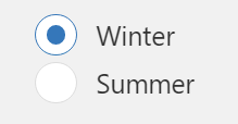
Radio Button
The radio button UI component allows users to select a single option from a set of mutually exclusive choices.
The widget is available under . When designing application pages, drag-and-drop radio to a container. To use the old version, refer to Radio Button.
Radio Button Properties
| Field Name | Description |
|---|---|
| Label | A label name that appears as a header for the radio button. |
| Selected Item | Select a Query or a Global
to specify the target data source, wherein data is updated based on the radio
button user selection. Note: The data types of both these
properties must match to ensure proper functionality - Static Items and
Selected Item. |
| Selection | Specify the input data source to receive values for the radio button, which generates the available choices for the user. See Bind Your Data to Plug-ins. |
| Static Items | Use this property if the radio button items are fixed choices. Select +Add to add multiple items. For each item, specify a display text and value. |
| Dynamic Items | Use this property to specify a query and dynamically generate items for the radio button. The options are not pre-defined or hardcoded. During runtime based on user inputs, data is retrieved from a data source. |
| Sort Items | Select the check box to arrange the radio button options/choices in ascending or descending order. |
| Label Styling | Formats the label: Font Family, Font Size, and Font Color formats the label text. Background Color adds a color to the label background. |
| Hidden | Select this check box if you want to hide the
plug-in. To show the hidden plug-in in Operations Hub new layout, go
to Page Visuals and under
Action column, select  for the hidden plug-in. See Page Visuals Tab. for the hidden plug-in. See Page Visuals Tab. |