Graphs
About Graphs
This topic provides a listing of all overviews and high level explanatory information to help you understand graphs.
About the Types of Graphs
The following table describes the graph types that are supported by Predix Essentials.
| Graph Type | Button | Useful For... |
| Bar Graphs | ||
| Stacked Column |
| Comparing a set or series of values to the same scale, unit of comparison, or range of time. The information on a bar graph is represented by vertical or horizontal bars. |
| Stacked Bar |
| |
| Clustered Column |
| |
| Clustered Bar |
| |
| Color Scale Graph | 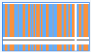 | |
| Line Graphs | ||
| Line |
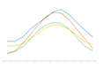
| Identifying trends by comparing a series of values. The data that is displayed on a line graph is represented by a line whose peaks and crevices indicate changes in the data. |
| Area |

| Identifying trends by tracking a series of values measured against a set scale. The information in an area graph is displayed in linear form. |
| Stacked Area |

| Identifying trends by tracking a series of values measured over time or other category data. The information in a stacked area graph is displayed in linear form. |
| Pie Graph | ||
| Pie |

| Comparing a portion of the data to the whole. For example, you could use the pie graph to determine the percentage of energy that is used by a particular piece of equipment or group of equipment. |
| Doughnut |

| Comparing portions of the data to one another. For example, you could use a doughnut graph to determine which manufacturer's centrifugal pumps are most active. |
| Pyramid |

| Displaying hierarchical structure of data. For example, you could use a pyramid graph to display the contributing factors to a failure arranged in the order of magnitude. |
| Radar Graph | ||
| Radar |

| Displaying multi-source values as they relate to one another. For example, you could use a radar graph to compare your allocated versus budgeted spending, where you can also view the level of spending per expense category (e.g., marketing and salaries). The data in a radar graph is displayed in a plot that resembles a spiderweb. |
| Filled Radar |

| |
| Scatter Plots | ||
| Scatter |
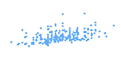
| Comparing a series of x and y coordinates, and identifying relationships between values in an x, y coordinate. For example, you could use a scatter plot to view the cost of repair by failure date for a group of equipment. |
| Bubble |
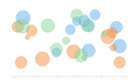
| Comparing a series of x and y values with z sizes, and identifying relationships between values of different sizes in an x, y coordinate. For example, you could use a bubble plot to view the cost of repair by failure date for a group of equipment, where the bubble marker size is determined by the criticality indicator for each piece of equipment in the group. |
| Stock Graphs | ||
| Line |
| Comparing the trend of a particular value over time. For example, you could use a line graph to plot the cost of repair for the past four years. The graph helps you visualize how the cost of repair has been increasing or decreasing over time. |
| Area |
| |
| Stacked Area |
| Comparing the trend of multiple values over time. For example, you could use a stacked line graph to plot the cost of repair and the cost of operator training for the past four years. The graph helps you visualize if the increase in the cost of operator training leads to a decrease in the cost of repair. |
| Heat Map Graphs | ||
| Heat Map |
| Displays data using a range of colors to give an immediate visual summary of values to identify trends and potential problems. |
Create a Graph
Procedure
- In the upper-right corner of the page, select Create New.
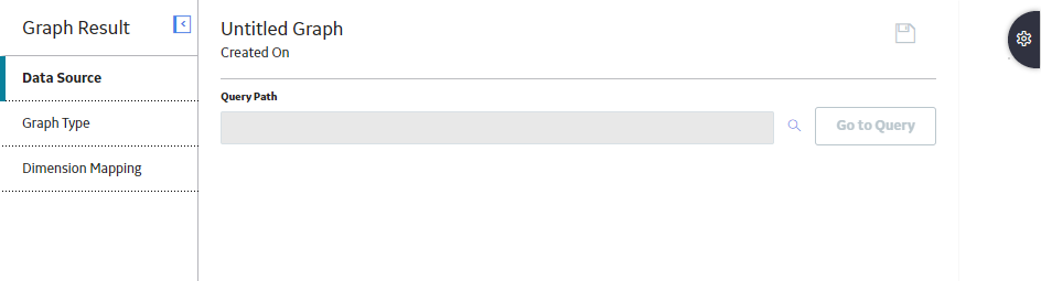
The Data Source workspace appears.
- In the upper-right corner of the page, select
 .Tip: You can also select
 to save the graph in a different location.
The graph is created, and stored in the specified Catalog folder.
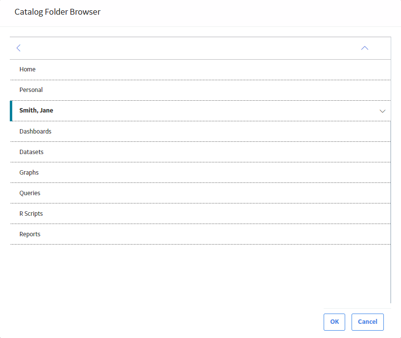
Copy a Graph
About This Task
This topic describes how to copy a graph to a different Catalog folder.
- You can copy a graph into a Catalog folder only if you have Create permissions for that folder. You cannot, however, copy a graph into a Baseline folder.
- For more information on the Catalog page, refer the Catalog module documentation.
Procedure
- In the upper-right corner of the workspace, select
 .
.The Catalog Folder Browser window appears.
Select a Data Source
About This Task
To create a graph, you must select one of the following types of data sources from the Catalog:
- Queries
- Datasets
This topic describes how to select or modify a data source for a graph.
Procedure
- In the left pane, select Data Source.
The Data Source workspace appears.
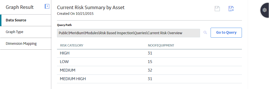
- Next to the Query Path or the Dataset Path box, select
 .
.The Select a query, or a dataset from the catalog window appears.
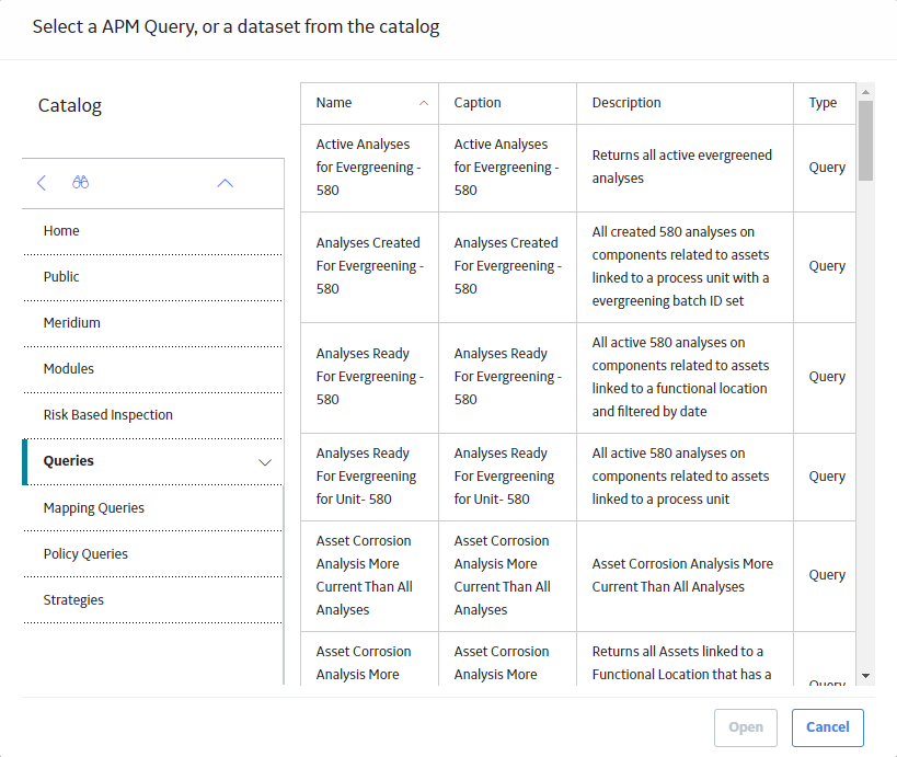
- Select the query or the dataset, and then in the lower-right corner of the window, select Open.Note: If the query that you have selected contains a prompt, then a window appears, displaying the prompt. Provide the required values, and then select Done.
The Query Path or the Dataset Path box is populated with the folder path of the query or the dataset that you selected.
If you have selected a query, then the results of the query appear in the workspace.
-or-
If you have selected a dataset, then the values in the dataset appear in the workspace.
What To Do Next
Modify the Graph Type
Procedure
- Select the type of graph that you want to use. The bar graph is selected by default.
For example, if you want to change the graph type to a pie graph, select
 .
. - In the upper-right corner of the page, select .
The graph type is changed.
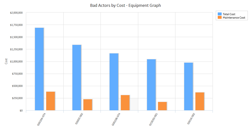
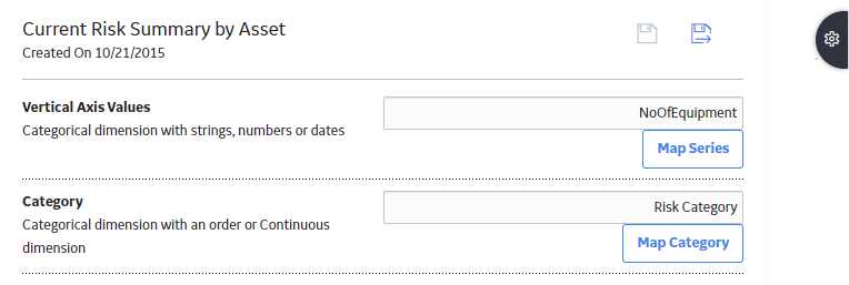
About Graph Dimensions
The Data Source workspace displays a list of the columns or fields that exist in the underlying query or dataset. The graph dimensions will adjust automatically based on your settings.
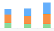
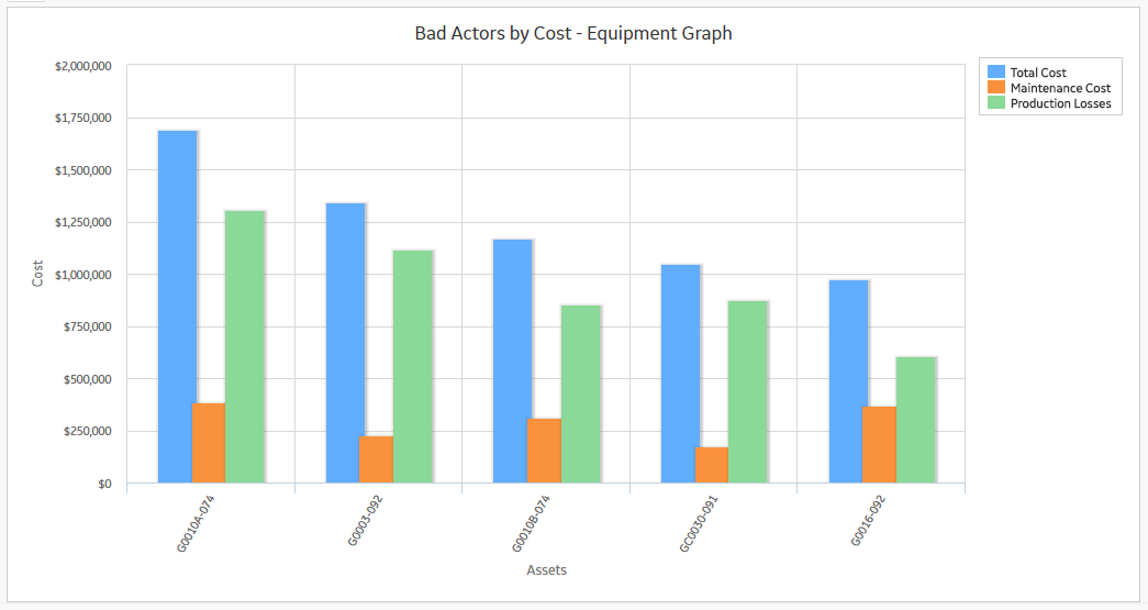
Suppose you have a query with the following results:
| Equipment Technical Number | Total Cost | Maintenance Cost |
|---|---|---|
| G0010A-074 | 1690651 | 386387 |
| G0003-092 | 1341803 | 228380 |
| G0010B-074 | 1166331 | 312371 |
| GC0030-091 | 1046865 | 175728 |
| G0016-092 | 975146 | 369122 |
A graph that you build from this query could display the Bad Actors by total cost, as shown in the following image:

...or both total cost and maintenance cost for each asset, as shown in the following image.
Specify the Graph Dimensions
Before You Begin
Procedure
- In the left pane, select Dimension Mapping.
The Dimension Mapping workspace appears.
 Note: If you are mapping the dimensions for a heat map or color scale graph, you will be mapping columns instead of a series.
 - Select .
Access the Query or Dataset Associated with a Graph
Before You Begin
Procedure
- In the upper-left corner of the Graph Result workspace, select
 .
.The query or dataset appears.
Refresh a Graph
About This Task
You can refresh a graph to ensure that the graph is displaying the most recent database information and configuration options. For example, you might want to refresh the graph to rerun the associated query, or to see the effect of adding a record to the database.
Procedure
- In the upper-left corner of the Graph Result workspace, select
 .
.The graph refreshes to display the most recent information.
About Hyperlinks on Graphs
You can add hyperlinks to a graph to access any Predix Essentials module addressable via a URL or an external website. When a hyperlink has been added to a graph, selecting a datapoint on the graph will display the location defined for the link.
When you add a hyperlink to a graph, you can configure it such that when you select a datapoint on the graph, a specific value from the graph will be passed in as a parameter value to the URL. You can pass any of the following values into the URL:
- The vertical value of the selected datapoint
- The x-axis value of the selected datapoint
- The value stored in a specific field in the record associated with the selected datapoint
- The Family Key of the record associated with the selected datapoint
- The Entity Key of the record associated with the selected datapoint
- All the values for any previously accessed graph
Add a Hyperlink to a Graph
Before You Begin
- Create a hyperlink for the query to which you want to add the hyperlink.
Procedure
- In the upper-right corner of the workspace, select
 .
.The Settings pane appears.
About the Vertical Axis Scales
When you choose a column or field to be plotted on the y-axis, you must specify the side of the graph on which the axis will appear: left or right. You can do so using the options that are available in the Dimension Mapping workspace.
If you choose to plot more than one column or field on the y-axis and the values in those columns or fields vary greatly, using a right and left y-axis can improve the usability of the graph.
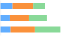
Suppose you have a graph with the following underlying data:
| Equipment Technical Number | Total Cost | Maintenance Cost | Production Losses |
|---|---|---|---|
| G0010A-074 | 1690651 | 386387 | 1304264 |
| G0003-092 | 1341803 | 228380 | 1113423 |
| G0010B-074 | 1166331 | 312371 | 853960 |
| GC0030-091 | 1046865 | 175728 | 871137 |
| G0016-092 | 975146 | 369122 | 606024 |
In this example, if we plot a graph with multiple vertical axis values, it allows you to compare total cost, maintenance cost, and production loss, which provides a fuller picture of your assets.
Specify the Limits for Vertical Axis Values
Procedure
- In the upper-right corner of the workspace, select .
The Settings pane appears.
Specify the Format of the Vertical Axis Values
Procedure
- In the upper-right corner of the workspace, select .
The Settings pane appears.
Specify the Number of Decimals for the Vertical Axis Values
Procedure
- In the upper-right corner of the workspace, select .
The Settings pane appears.
Convert to a Three-dimensional Graph
About This Task
When you create a graph, by default, it is plotted as a two-dimensional graph. This topic describes how to convert it to a three-dimensional graph.
You can view a three-dimensional graph only for the following types of graphs:
- Bar graphs
- Pie graphs
Procedure
- In the upper-right corner of the workspace, select .
The Settings pane appears.
Show or Hide the Legend
Procedure
- In the workspace, select .The Settings pane appears.
Show or Hide Grid Lines
Procedure
- In the upper-right corner of the workspace, select .
The Settings pane appears.
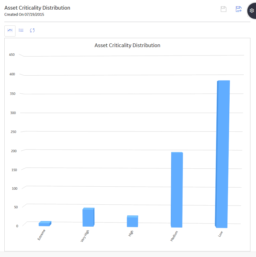
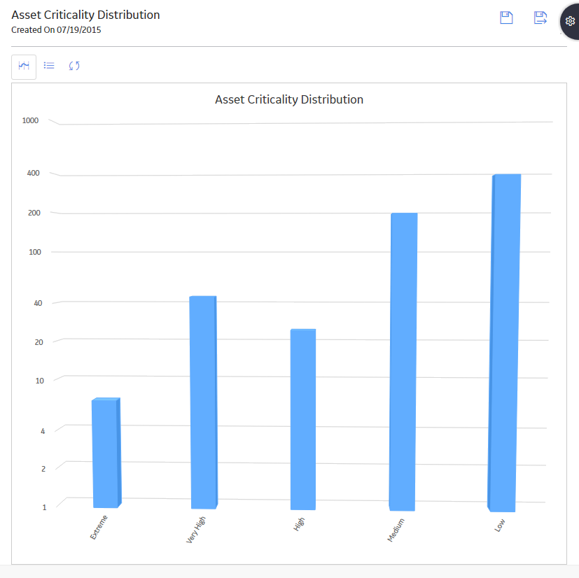
Enable or Disable Logarithmic Scale
About This Task
Procedure
- In the upper-right corner of the workspace, select .
The Settings pane appears.
Example
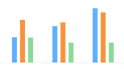
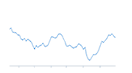
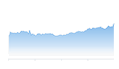
For example, the following image shows a graph whose values on the scale are displayed using the Number format option when the Logarithmic box is cleared.
If you were to select the Logarithmic box, the same graph would appear as shown in the following image.
Show or Hide the Labels of a Graph
Procedure
- In the upper-right corner of the workspace, select .
The Settings pane appears.
Show or Hide the Scroll Bar
Procedure
- In the upper-right corner of the workspace, select .
The Settings pane appears.
Show Full Graph Labels
About This Task
The labels that appear on graphs are truncated by default. If necessary, you can modify the graph settings to show the full-length labels.
Procedure
- In the upper-right corner of the workspace, select .
The Settings pane appears.
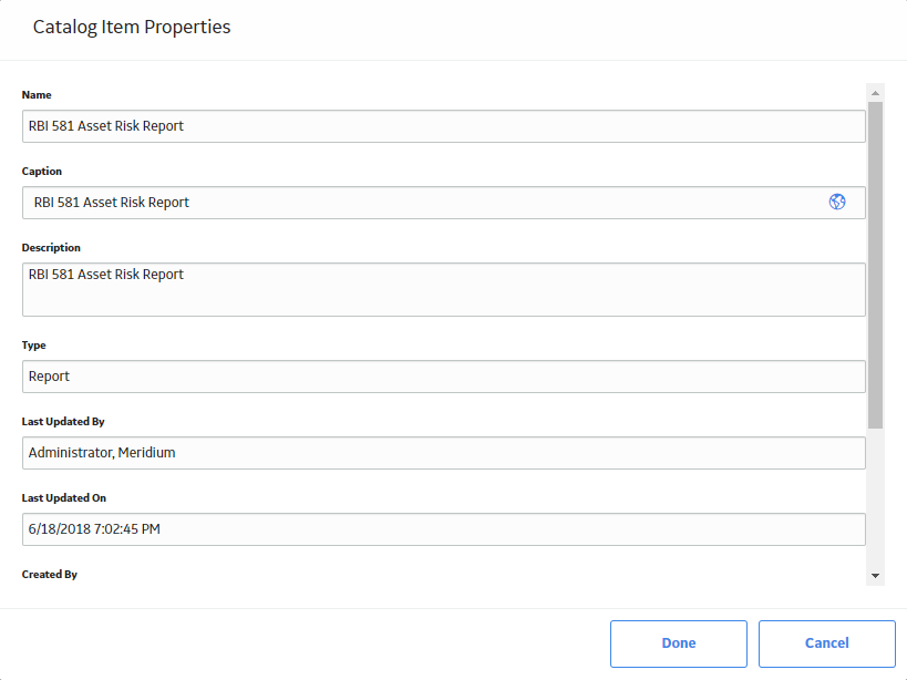
Modify the Name, Caption, and Description of a Graph
About This Task
When you create a graph, you provide the name, caption, and description of the graph, and store it in the Catalog. This topic describes how to modify these properties by accessing the graph from the Catalog.
To modify Catalog item properties, you must have View and Edit permissions to the folder.
- If you transfer ownership of a Catalog item to another user, but the item resides within a folder to which that user does not have View permissions, the user will not be able to view the Catalog item.
- For more information on the Catalog page, refer the Catalog module documentation.
Procedure
- In the row for the graph whose properties you want to modify, select .
The Catalog Item Properties window appears, displaying the properties for the selected graph.
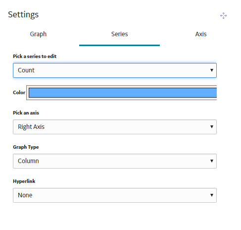
Modify the Colors of a Graph
Procedure
- In the upper-right corner of the workspace, select .
The Settings pane appears.
- Select the Series tab.
The Series section appears.
Make a Prompt Appear on a Graph
About This Task
To make a prompt appear on a graph, you must create the prompt for the query that is used to generate the graph.
Procedure
Export a Graph
You can export a graph to a PDF document.
Procedure
- Select
 . The Print window appears.
Delete a Graph
Procedure
- In the upper-right corner of the page, select
 .
.A confirmation message appears, asking if you really want to delete the graph.