The Fleet Report
The Fleet Report
- CLPM analytics process raw tag data and produce results that are interpolated. These interpolated results are then used to produce the Fleet Report chart and table.
- The measures presented in the Fleet Report are derived from KPIs that are produced by CLPM analytics. Consult the KPI Reference for details on these KPIs.
Access the Fleet Report
Procedure
- Modify the asset context by selecting SELECT ASSET CONTEXT, navigating to the asset, and then selecting OPEN.
- Modify the date range for which the data is reported.
Modify the Date Range for a Fleet Report
Procedure
Average Control Loop Performance Chart
About the Average Control Loop Performance Chart
- Manual
- Auto
- Cascade
- Shutdown
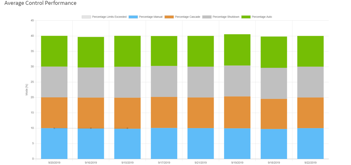
- x-axis: Represents the date for which the data is plotted.
- y-axis: Represents the percentage of time the control element operated at each control mode. It is calculated based on hourly samples for each date.
The Diagnostic Alerts Filtering Smart Filter
- Identify control loops based on diagnostic alerts.
- Classify the loops in three fault categories, namely Sensor, Actuator, and Tuning.
- Drill down into the status of the alerts to find the list of control loops where action is needed.
- Identify bad actors (poorly performing loops) among a large set of control loop assets.
The filter displays the number of alerts for each fault mode and the total number of alerts using interactive pie charts.
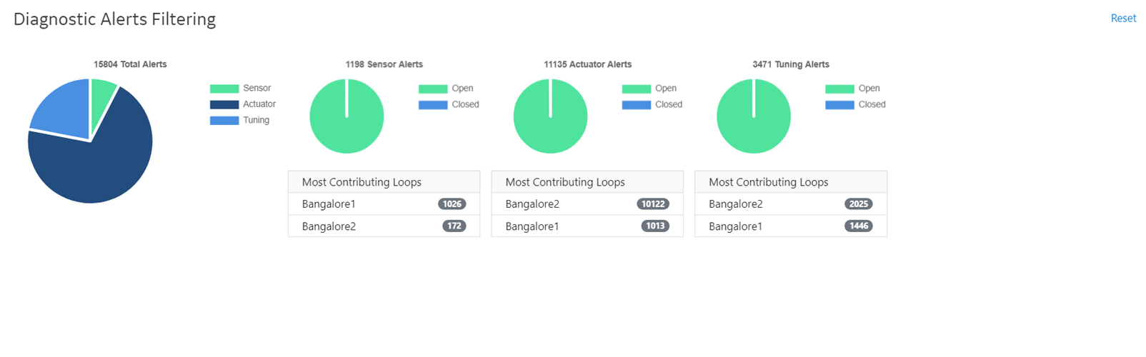
The pie charts illustrate the different fault modes of your control loops and the corresponding number of alerts. Each pie chart is further classified based on the alert status. The pie charts display the total the number of open and closed alerts. Each pie chart has a list displaying the top three control loops contributing the most number of alerts, in descending order.
On selecting the Open area of the pie chart, the details about the loops with the open alerts are updated in the list below the pie charts. Also, the Control Loop Performance table is updated to list only the control loops with open alerts.
The Control Loop Performance Table
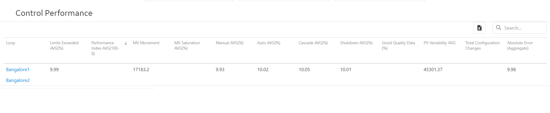
In the Fleet Report, you can modify the reporting period by selecting a date prior to the current date in the Date Selector box. You can sort data based on any column in this table. By default, the table is sorted based on the value in the Performance Index AVG (100-0) column.
- Applying a global filter on the table
- Using multiple-level filters
- Using text in the filter field
- Using conditional parameters
You can search for a specific control loop using different search options.
For each loop in the selected asset context, the table contains the following information.
| Loop Statistic | Interpretation |
|---|---|
|
Loop |
The name of the control loop asset. If you select the link in this column, the Loop Report appears. |
|
Limits Exceeded AVG (%) |
The percentage of time for which the loop was in Auto, Cascade, or Manual mode, where the limits for these modes were exceeded. The time when the loop was in shutdown mode is not included in this statistic. |
|
Performance Index AVG (100-0) |
The average of the performance index during the specified reporting period. The value ranges from 100 to 0, where 100 indicates poor performance and 0 indicates good performance. By default, the table is sorted based on the value in this column. The performance index is an aggregate of the following values in the following proportions:
A higher average performance index indicates that the loop is not performing well. |
|
MV Movement |
The average number of oscillations of the manipulated variable. You can use this statistic to investigate the ability of the control element to maintain the PV operating within process limits. |
|
MV Saturation AVG (%) |
The percentage of time that the MV for each loop was saturated. |
|
Manual AVG (%) |
The percentage of time that the loop was in the manual control mode. |
|
Auto AVG (%) |
The percentage of time that the loop was in the auto control mode. |
|
Cascade AVG (%) |
The percentage of time that the loop was in the cascade control mode. |
|
Shutdown AVG (%) |
The percentage of time that the loop was in the shutdown control mode. |
|
Good Quality Data (%) |
The percentage of time that the data was of good quality. |
|
PV Variability AVG |
The average PV variability. This value is a measure of the data spread in the PV data set, expressed as a percentage. This is the average value of the PV Variability KPI. Refer to the KPI Reference for the definition of this KPI. |
|
Total Configuration Changes |
The number of times the controller configuration was changed during the reporting period. |
|
Absolute Error (Aggregate) AVG |
The average of the absolute values of all errors during the reporting period. Error is calculated as the difference between PV and SP. Tip: Sorting the table based on this field is useful only if all loops use the same unit of measure.
|