Each analysis within LCC has its own charts and graphs, located on the Analysis Summary. The charts and graphs provide a visual summary of the data collected within all of the scenarios in the analysis, and from here you are able to compare scenarios to determine which scenario has the best or worst performance.
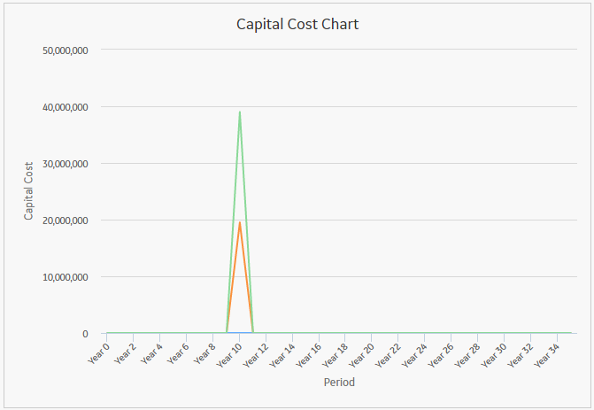
Capital Cost Chart
The Capital Cost Summary Chart displays the trend for each scenario, as well as the sum of all capital costs per period for each scenario.
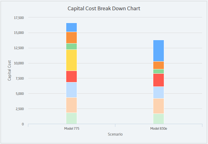
Capital Cost Break Down Chart
The Capital Cost Break Down Chart displays all the values that comprise the capital cost totals for each scenario in the analysis. Within the chart, you will see a complete breakdown of the costs contained in a scenario. If you hover over the individual capital costs, the title and details of the costs appear.
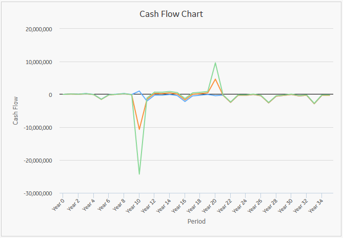
Cash Flow Chart
The Cash Flow Chart displays Cash Flow per period. All of the values from the Cost Data grid are factored into the output shown in the chart, making it easier for you to monitor the movement of money throughout the span of the Analysis and easily view and determine which scenario has the optimal cash flow as compared with other scenarios.
Depreciated Value Chart
The Depreciated Value Chart displays Depreciated Values per period for each scenario, detailing how the asset's value has been depreciated throughout the analysis. The chart allows you to assess the overall depreciation so that a corrective course of action can be determined.

Operating Cost Chart
The Operating Cost Chart displays the trend, as well as the sum of all operating costs per period for each scenario. The chart allows you to review the overall Operating Costs of an Analysis and make decisions regarding future courses of action.

Operating Cost Break Down Chart
The Operating Cost Break Down Chart displays stacked bars for each scenario that are broken down by element; these break down the operating costs by elements. The Break Down chart enables you to see where money is being spent within each scenario, identifying major cost drivers and target areas for cost reduction. If you hover over the individual operating costs, the title and details of the costs appear.

Present Value Chart
The Present Value Chart displays Present Values per period for each scenario. Present Values are determined based on the Interest Rate.
The chart provides information to allow you to accurately view your Analysis's expected worth based on the current Interest Rate.

Copyright © 2017 General Electric Company. All rights reserved.